
Blog
CRI Matters: Why Good LEDs Make Cabinets and Countertops Look Expensive
CRI: Color Rendering Index
If you’ve ever walked into a showroom kitchen and thought, “Wow, that countertop looks richer,” or “Those cabinets look custom,” there’s a strong chance you weren’t just reacting to the materials—you were reacting to the lighting.
Specifically, you were seeing the impact of CRI, one of the most overlooked variables in a home remodel.
CRI stands for Color Rendering Index. In plain terms: it’s a score that tells you how accurately a light source reveals colors compared to natural daylight. And when you’re spending real money on cabinets, countertops, tile, hardware, and paint, inaccurate lighting can quietly undermine the entire investment.
This is why the right LED lighting can make finishes look crisp, premium, and intentional—while the wrong LEDs can make even high-end selections look flat, dull, or “off.”
What CRI Actually Does (Without the Science Lecture)
Most homeowners choose lighting based on brightness, style, and maybe color temperature (warm vs. cool). CRI is different.
CRI affects how materials read—how you perceive:
● whites vs. creams
● warm woods vs. ashy woods
● veining in quartz or marble
● true undertones in paint
● the richness of brass, gold, bronze, and black hardware
A higher CRI means you’ll see more accurate, nuanced color—so surfaces look deeper, cleaner, and more “expensive.”
Quick rule of thumb:
● 90+ CRI = strong “designer finish” look
● 80–89 CRI = acceptable for general use, not ideal for feature spaces
● Below 80 CRI = colors can shift noticeably (and not in a good way)
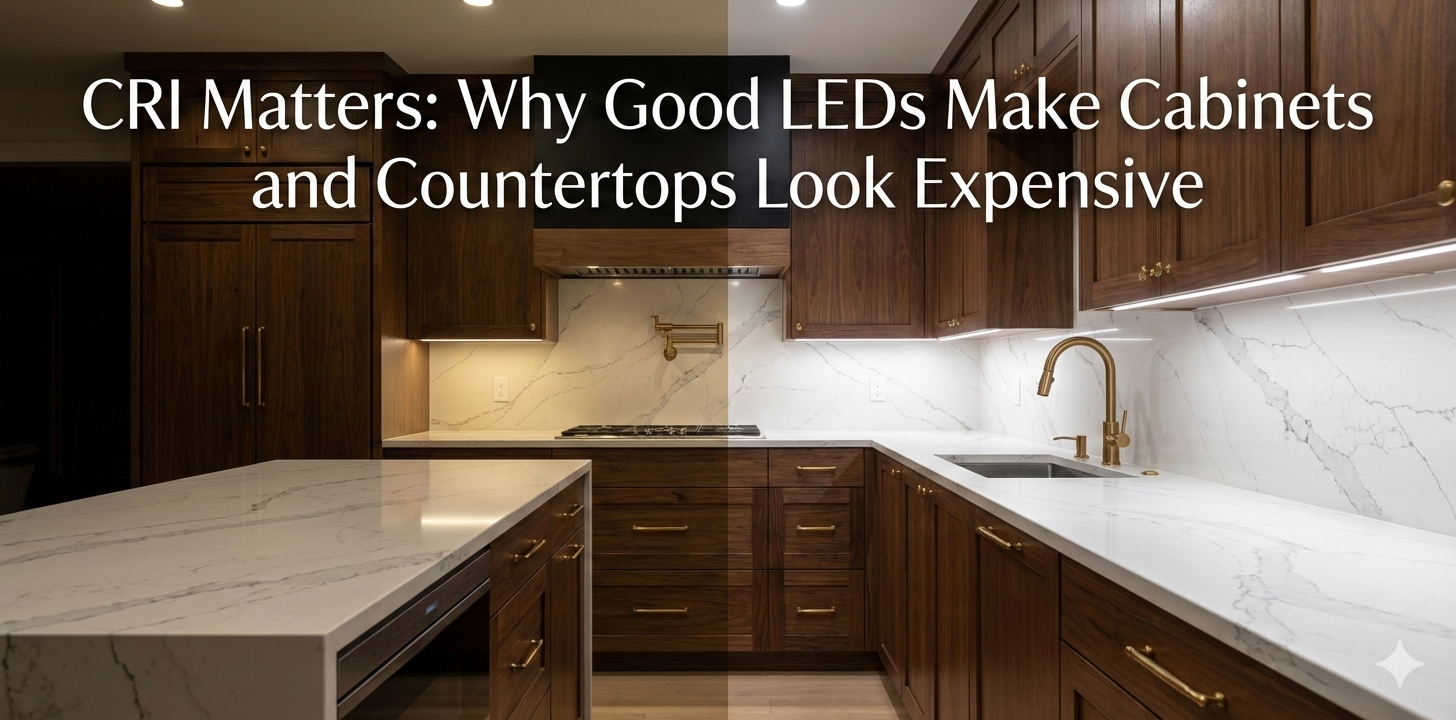
Why Cabinets and Countertops Are Especially Sensitive to CRI
Kitchens are essentially a materials showroom: cabinetry, stone, metal, tile, wood, paint—often all in one sightline. If the lighting distorts color, your eye reads the whole space as lower quality, even if you chose great products.
High-CRI LEDs elevate cabinets and countertops because they reveal:
● true grain variation in stained or natural wood
● clean separation between cabinet color and wall paint
● depth and veining in quartz/quartzite/marble
● correct warmth in off-whites and creams (no “green” or “gray” cast)
● accurate metallic finish on pulls, faucets, and lighting fixtures
In other words, CRI doesn’t just “light the space”—it validates your selections.
What to Look for When Buying LEDs
When you’re shopping bulbs, under-cabinet lighting, recessed LEDs, or linear strips, use this checklist:
● CRI 90+ (minimum) for kitchens, baths, and anywhere you care about finishes
● R9 value (if available) — helps reds look real (important for warm woods and some stones)
● Consistent color temperature across the space (don’t mix random “warm” products)
● Dimmable + compatible with your dimmer type (avoid flicker and buzzing)
● No visible hotspots for under-cabinet strips (diffused lens helps)
● High-quality drivers for tape light systems (cheap drivers create uneven output)
If the packaging doesn’t clearly list CRI, that’s often a sign the manufacturer isn’t optimizing for color accuracy.
Color Temperature vs. CRI: Not the Same Thing
Homeowners commonly assume “warm light” equals “better light.” Not necessarily.
● Color temperature (Kelvin) = how warm or cool the light appears
● CRI = how accurately that light shows colors
You can have a warm 2700K bulb with mediocre CRI that makes your countertop look muddy. Or a 3000K LED with high CRI that makes whites look clean and wood look rich.
Practical guidance for remodels:
● 2700K: cozy, warm, traditional (great in adjacent living spaces)
● 3000K: balanced, modern-warm (excellent for kitchens and baths)
● 3500K+: cooler/clinical (can work in task areas, but less forgiving)
If you want a high-end look, prioritize CRI first, then select the Kelvin range that matches your style.
Where High-CRI Lighting Pays Off the Most
If you’re budget-conscious, focus high-CRI lighting where it’s most visible and most critical.
Best ROI locations:
● Under-cabinet lighting (it directly hits countertops and backsplash)
● Kitchen ceiling downlights (overall color perception)
● Pendant lights over islands (feature lighting + reflections off stone)
● Vanity lighting in bathrooms (skin tone accuracy matters, too)
● Display lighting for glass cabinets or open shelving
Even one upgrade—like high-CRI under-cabinet LEDs—can dramatically improve how your counters and backsplash photograph and feel in real life.
Common Mistakes That Make Remodels Look Cheaper Than They Are
Avoid these frequent lighting missteps:
● Picking “daylight” bulbs (5000K+) thinking it looks more “clean”
● Mixing LED brands and color temperatures across fixtures
● Choosing the lowest-cost tape light with visible dots and poor diffusion
● Installing bright lights with poor color rendering (harsh, flat, gray)
● Skipping layered lighting (only overhead = shadows and dull surfaces)
Lighting is one of the few remodel decisions that affects everything else you bought.